MCPE/Bedrock Smaller Shield
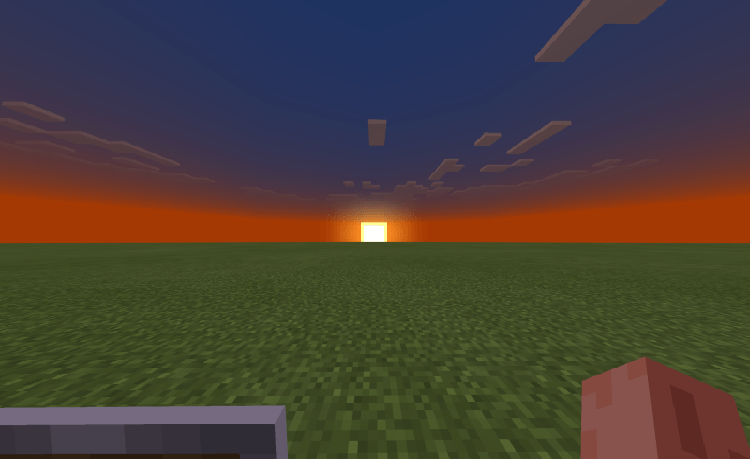
The shield's visual has been shrunk by a few pixels in each direction and its position is adjusted slightly to make it less obtrusive on your screen without changing its functionality or hitbox.
Getting your first shield for the is really exciting but after awhile it becomes really annoying as it covers almost 1/4 of the screen so I made this pack to hopefully fix that. By shrinking the shield base texture (not including the handle, its still the same size) by a few pixels in both the x and y axis, (and moving the handle texture closer to make the texture size smaller,) then readjusting the size and UV mapping, the shield now looks significantly smaller and takes up less space!
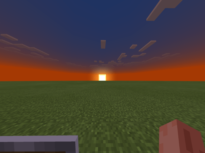
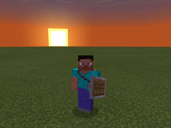
Thanks to @Xisumavoid for the idea of adjusting the shield and @HiiperVenomZz's lower shield pack for pushing me want to make this pack (to fix the problem with the shield hanging out of the inventory icon - I couldn't stop looking at that little lip hanging out). It really helped to look through their code and understand what they did.
*Recent Minecraft updates have made this pack slightly redundant, the shield in the offhand is now displayed lower (not smaller) automatically with the vanilla textures so that it's out of view when not sneaking. (Pictures are from before that update)
- Changed name of texture file
- Added various files to improve loading, allowing caching the texture (hopefully decreases lagginess)


